3 Main Types of Charts Used in Forex Trading

Forex trading requires traders to keep an eye on currency price actions. To do this, they learn to read forex charts. These charts are graphical representations of the historical price movements of a currency pair across various timeframes. By analysing these movements, traders attempt to identify existing or upcoming trends, potential trend reversals, price breakouts and more. This then helps them to make informed trading decisions.
Traders today have access to robust charting software to analyse the markets. For instance, MetaTrader 4 allows traders to open several forex charts at the same time, with customisable settings, like price, volume and open interest. For new traders, however, it is bests to first get the basics right.
There are 3 main types of forex charts: line charts, bar charts and candlestick charts. Timeframes for these chart types can range from tick data to yearly data. Typically, the Y-axis depicts exchange rates, while the X-axis represents the timeframe.
1. Line Charts
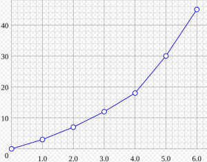
The most basic chart is a line chart, which only shows the closing prices of a currency over a period of time. A continuous line is formed by connecting these price points on the chart. Line charts are useful for a quick look at the direction of price movement over a specific timeframe. Traders can spot an existing overall trend. Since these charts only show closing prices, they can be helpful in avoiding price noise during the busiest hours of trading during the day. For some traders, using charts that contain too much information could be confusing, which could then lead to poor trading decisions.

Image Source: https://en.wikipedia.org/wiki/Line_chart
Line charts could be useful for new traders, especially to learn the basics of chart reading before moving on to more advanced charts. Line charts are also considered more suitable for fundamental traders, although technical indicators can be easily applied to these charts.
However, line charts do not provide as much information as needed to create advanced forex strategies. For instance, for a trend following trader relying on multiple small positions is likely to find a line chart insufficient.
2. Bar Charts
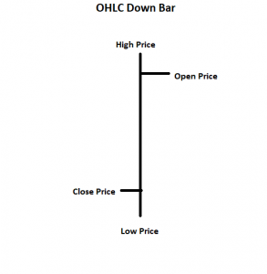
Bar charts provide more information than line charts, such as open, high, low, close (OHLC) prices. This is why they are also referred to as “OHLC charts.” Each bar on the chart represents the time period the trader is looking at. For instance, in daily charts, one bar represents the trading activity (OHLC) for one particular day. Bars can represent as little as one minute’s worth of activities or as much as yearly values.
A vertical line represents the high and low price of the day, while two horizontal dashes constitute the opening and closing prices. A bar that has a closing price higher than the opening price is referred to as an up bar. When the closing price is lower than the open price, the bar is called a down bar.
Bar chart timeframes can be daily, monthly, 30-minute, 10-minute, or anything that suits a trader’s strategy. Before advanced software made candlestick charts available for retail traders, bar charts were the most reliable ones. They are much more useful than line charts in determining price momentum.
Some traders can also choose to look at tick bars. These bars represent price tick activities, which is a specific number of price changes, rather than price activity over a specified period of time. This way, traders can quantify trading activity.

3. Candlestick Charts
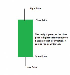
Candlestick charts are the most widely used forex charts. Also known as Japanese Candlesticks, these charts offer comprehensive market information to help decide when to enter or exit trades. Although these charts offer the same information as bar charts, the colour coding of the candles allows traders to gauge the market trend much more easily. For instance, if a trader sees several green candles consecutively, it is a quick way of telling that the market is on an uptrend.
Just as the name suggests, the chart consists of candlesticks that have a distinct real body, an upper wick and a lower wick. The shadow or real body of the candlestick shows the open and closing price of a currency, while the upper and lower wicks represent the high and low price of the day, respectively. The shape of candlesticks can vary according to the price activity during a specific time period.
Long green/white candlesticks represent bullish price momentum, while long red/black candlesticks are considered to signal bearish pressure.
However, every candlestick has to be studied in the context of market movement, rather than individually. They can also be time sensitive. For starters, they are applicable within the limitations of the chart’s timeframe, whether it is intraday, weekly or monthly. Also, their reliability can decrease after 5 bars of the pattern formation.
There are several candlestick patterns, like the hammer, doji star, bullish engulfing, bearish engulfing and more, which can help traders predict price action, momentum and chances of price reversal. For instance, the hammer candlestick pattern can form when the price of a currency pair moves significantly lower after the open, only to go higher near the close. On the other hand, engulfing patterns can point towards a potential trend reversal. Here, the first candlestick has a much smaller real body, compared to the consecutive candlestick, which “engulfs” it. Based on such patterns, it is possible to form short-term and long-term trading strategies.

Image Source: https://dev101.info/fca/day-trading-series-reversal-breakout-pattern/
It is a good idea to learn how to read forex charts, so that traders can conduct effective technical analysis. Major charting systems allow traders to add technical indicators, as overlays on the chart. Based on the price data they capture, these statistical tools can help point towards suitable entry-exit points and points to place stop-losses or take-profit orders.
However, remember that different timeframes can lead to varying chart activity. Also, overcrowding charts with too many indicators and signals can be confusing.
Reference Links
- https://www.thebalance.com/forex-charts-1344893
- https://www.investopedia.com/terms/forex/c/currency-conversion-forex-charts.asp
- https://www.investopedia.com/terms/c/candlestick.asp
- https://www.investopedia.com/articles/active-trading/092315/5-most-powerful-candlestick-patterns.asp


